Not sure if I’ll have enough time to work on the wings tomorrow so I’ll post tonight ^__^
I’ve never done a light source from underneath before…it’s a bit of a pain in the ass T__T
Sunday, August 31, 2008 at 9:09 pm
Not sure if I’ll have enough time to work on the wings tomorrow so I’ll post tonight ^__^
I’ve never done a light source from underneath before…it’s a bit of a pain in the ass T__T
Wednesday, July 9, 2008 at 5:13 pm
Since this post is long, I’ll cut it for the people who watch my personal LJ too.
Erebos and Scry Prints
Another insainly long post art. Not sure what I’m gonna put up on my site/DA yet. I’ll be doing a digital version of Erebos though.
Demoni!Scryren
For my first plate, I took mini-demon Scry from Fur Sketch #9
Demon Scry #1
Just a black and white version with nothing special done to it. I saw how the spots where I rub were lighter and wanted to play with that.
Demon Scry #2
Which is how I ended up with this. Only problem is if you don’t rub really well, a lotta ink stays in those lines. Sometimes you get really cool speed lines, and in times like this, you get splotches.
Demon Scry #3
Playing with color. I wanted to make a colle with green tissue paper for the clouds but light paper (which air moves easily) isn’t best for colles–so I put the “clouds” in place on the plate, then when the magenta was rolled on top, it picked up the tissue paper as it went over it, leaving no ink under it. I was going for more of my old stuff with the colors but the magenta failed me, multiple times X__X
Demon Scry Plate
And here’s a photo of the plate. 6×8, etch in zinc.
Black ICE – Erebos
Erebos was done on three 9×12 plates but more about that later when I show the plate photos. But that also means he’s bigger than my scanner bed, so there’s about a half inch that gets cut off on both sides. I have more versions of this than I know what to do with >.>;;
Erebos BW
This is the finished black and white print. Just black ink rubbed into the plates. Here’s a crappy photo so you can see the whole thing.
Erebos Chine Colle
I was going for the green on top of black sci-fi look, and then I found that RFID lookin’ paper. Here’s a photo of the full print and here’s a detail photo. You can actually see the building outline through the paper XD I’d actually love to see how all three plates together would look on the black paper but not anytime soon ^^;;
And here’s when things start getting complicated. Technically stuff….I found this cool reflective RFID lookin’ paper in the book store so I decided to colle it over the cityscape *soul flies out* The RFID paper gets traced and cut put backwards to match the plates, then I put all eleven of them on top of the cityscape plate in the right spot *crosses fingers* and they’re sprayed with adhesive. Then, when I roll it through the press, the backs with the glue get stuck to my paper, and I switch the cityscape plate out with my Erebos plate and roll it through again…and hope everything lined up where I wanted it to. Yeah, only did that twice and my second one was totally misregistered.
Erebos – Aquatint/Spray Paint Test Plate
So I gave up on the colles and make a third plate. This is my background plate by itself. Ironically it’s one of my favorite prints. Technical stuff below…
I wanted a gradient in the background so I transfered Erebos and the city plates to plate #3, and etched it in the acid just enough to get an outline so I could see what I was doing. Next, I let the aquatint stuff float down on top of it (it makes a very fine speckled pattern. You can see most of it at the top), torched it so it wouldn’t blow off and blocked out all of Erebos and the city with hardground…aka anywhere erebos or the city was I painted out *falls over dead*. Once it was dry, I misted a spray paint over it to make the gradient. Every where I painted or the spray paint is stays smooth (notice how by Erebos’s feet it’s still white? That’s because I put the spray paint down too heavy there X__X)
Erebos – Primary Colors
(Photo) Now that I have three plates, I started putting a different color on each one, hoping they would blend. They didn’t ’cause I was putting too much oil in my ink but I didn’t figure that out until later
Erebos – Red, Yellow, Black
(Photo – ph33r my foot) Still adding too much oil. I started playing with the roller on my background plate to get an even distribution of color while still seeing the aquatint (remember on the aquatint test print how everything was white where Erebos and the city where?). The photo isn’t picking up the detail in the sky, but it did what I wanted ^__^
Erebos – Primary Colors (Blending!)
And so the last day of class I found out I was adding too much oil and that’s why my colors weren’t blending *head desk* I inked up the black plate and rubbed from the center out to get the gradient and my professor inked up the other two plates with a little monotyping.
Erebos – Color
(The scanner’s butchering this print -.-;;) So later that day I tried again with the primary colors. If there’s one thing I’ve learned is that red ink is utter hell to rub off and blue will just come right off >__< But the yellow and blue blended to get the neon green I've been after since the colle and the red didn't turn into mud like I was expecting. To get the halo around Erebos and the building at the top I rubbed more of the blue ink out there, like I did with Demon Scry #2, only it looks horrible in the scan (it's doesn't stand out THAT much O_O;;).
Erebos Plate
Cityscape Plate
Background Plate
If you can see the diet coke can reflection in the cityscape plate, you’re looking to hard XD
My ceramics aren’t really DV related but the post is public Monster Cups
Saturday, June 28, 2008 at 3:05 pm

This is going to be a 9×12 etching for printmaking. The cityscape background is gonna be done on a separete plate but I’m still not happy with it so I haven’t bothered to scan it yet. The wires weren’t supposed to be so overwhelming either so I might just use my other plate for a multi plate with this one. I was also thinking of a chin colle with Black ICE notes. All the options I have…
Some minor character changes, just roughed up his design a bit. I’ve always been going for “monster” with the Oneiroi, not so much “gargoyle” but I can’t deny how much that show influences me. My favorite spots are his feet and where the wings attach to his back.
Ever since Running at Snail Speed I’m trying to stay with cyberpunk/political themes–more of Prisoners of War and not so much of Stop running, brat!. I love my characters to death, but I feel more accomplished when I sneak corporate shit in there.
Friday, May 2, 2008 at 9:20 pm

I found an abandoned sketech of Lothar and turned it into Reis. I had no idea what he looked like, other than I knew he had black hair and hazel eyes. Probably the fastest one I’ve ever done (pencil to finished in 9 hours). I should’ve been coloring the Wasteland comic but it’s been bothering me that he’s an important character and I don’t know what he looks like X__X
Friday, April 25, 2008 at 4:18 pm
Lothar’s Earring (Vector) & Ouroboros Tattoo (Vector)
Live trace versions that I’m not totally happy with but I thought I’d share.
Wasteland Comic
In Progress – read right to left
A flash project I’ve been working on and off all semester for class. I have the next five pages planned out but getting around to drawing it is my problem :/ The next/back buttons are at the top and bottom because I forgot to take monitor resolution into consideration. Note to self, the next time you make a flash comic, go horizontal.
This is the prelude to the wasteland fight, which means Lothar shouldn’t have his ouroboros earring yet. Whoops.
Friday, December 7, 2007 at 10:26 am
I thought I was done coloring for the night but I got the idea of making the cord glow and lost another four hours to photoshop. *drools* The chair’s giving me the creeps. When it’s zoomed out, it looks like tenticle monster got into a bottle of glitter. O__O;; I just wanted it to look like fabric. T__T
Friday, October 19, 2007 at 10:52 pm
Had to go with 20 x 30. When I added the chair it was getting cropped off >__< Oh well, I'm starting to get used to it. I want to add so much more to this tonight but I can't keep my eyes open anymore. I spy the makings of a background
The gray area is what will be visible if I print it at Kinkos, the white is if I (theoretically) had DA print it.
Sunday, October 14, 2007 at 11:46 pm
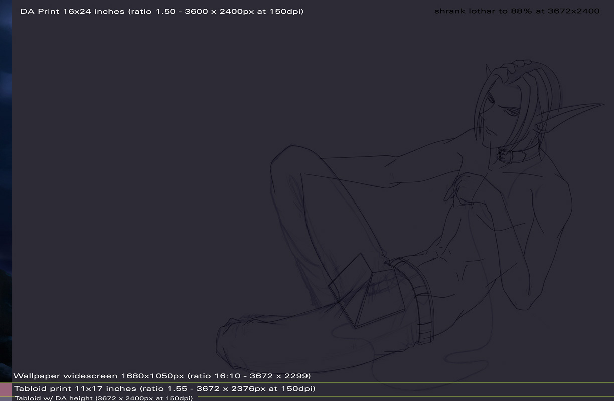
I’ve been trying to figure out what size/ratio to make my drawings at so I can print them larger than normal. Not movie poster size, but fairly large. I wanted to be able to meet DA’s print standards since they’re the only standards I know of, use it as a widescreen wallpaper and print at tabloid size (so I can print them myself at Kinkos at 11×17). That’s not asking much *rolls eyes*
16 x 24 inch print
20 x 30 inch print.
Both are “widescreen” because I foresee myself printing these off on 11 x 17 more than I do getting a DA subscription again and opening up a prints account. *eye twitch* But they’re also hell to find frames you can put them in without matting, same with 11 x 17. 16×20 and 20×24 are both the normal frame sizes. T__T
Anyhoot, I love huge posters, so I naturally went for the largest I could with 1.50 aspect ratio (20 x 30), but Lothar’s as big as he gets on that one–he’s at the size I drew him at** (he’s been shrunk for the smaller one) …and that’s a LOT of negative space and it makes his face too small. I like seeing my character’s eyes clearly. As much as I like large posters, I want my neg space to feel right and I want eye detail.
**And that’s why it’s nice to know how big you need the canvas at before you start outlining X___X
That brings me to the next largest 1.50, 16 x 24, which is still a large print. I had to shrink Lothar by 88% to get the negative space the way I wanted it. Lothar’s face is still clear enough and I have enough neg space left that I can go fairly deep into the background. Might go a little smaller though. We’ll see after I get the chair in.
Thursday, August 23, 2007 at 10:42 pm
Lothar fiddling with the neural jack cord
Last night I got the urge to draw some of the tech Lothar uses. They keyboard on the laptop is a touch screen (so there’s no actual keys to get food stuck in XD) and the screen is glass like in Minority Report…which I think is totally unusable but hey, it looks cool…much like navigating the net in 3D, completely inefficient but it looks sweet. He’s also going to have wireless earplugs and sitting in some comfy chair with a large picture window behind him.
This is what it’ll look like in the end. I ran out of paper. That’s also how I avoid tearing the shit out of my sketch book–do all the really rough stuff in Photoshop then draw it out XD
I’m trying to draw larger (and with a slight “leaning over” camera angle) and it’s throwing my proportions off X___X